Monday, 22 April 2019

Blurred Image Issues on Social Media

I have noticed over the past two to three months,
that the quality of uploaded images are okay when added to the blog,
but once uploaded to Pinterest, Instagram & Facebook,
they become blurred & horrible.
I know these sites want to cut down the resolution of these images
to get more on & prevent the sites loading too slow,
but as I recently agreed to showcase products for
Hunkydory crafts UK, I need my artwork to be seen.
So I spent a lot of yesterday asking questions
& trawling the net trying to find answers to my problem. 
I think I might have found one.
Some of the photo editing apps I looked at were great,
until it came to using the images. They upload great
to Pinterest, BUT they do not link back to me!!
What is the point of adding content if people can't link back to your blog??

Well today I am trying a test post with a image I have resized
especially for Pinterest. 
I am adding it here & then uploading to Pinterest from here. 
I will be interested to see if the image quality is affected. 

If this is a success I will share my source.
No good raving about something if it doesn't work, right?
 

Sunday, 21 April 2019

More Easter Cards

Here are the rest of the Easter cards.
This first one is for my sister, Tracy.
She is a clean & simple lover & so I added vellum,
 to create movement & give light.
  This was actually the first one I made but had to wait to share.
Instead of using both pieces of the die set, 
I used just the inner piece & cut it straight from the card blank.
I die cut the card blank using the Moonstone Arched Window die 1 by
Hunkydory crafts.
 I used the same Hunkydory die to cut the vellum.
I added the vellum directly behind the birds & left the other piece loose.


Next one, card blank again cut using Moonstone Arches,
I love how the sun plays on this card making it look two different colours. 
It's like the arched dies were made for these card blanks, you wouldn't think I did it, you would think they were bought like it. The dies cut so cleanly. 
I used both pieces of the die & attached to the card front.
 

The final design was made in the same way as the card above,
but it was cut from Soft Seafoam cardstock - Stampin' Up.
I bought this & matching ink. It is one of my favourite shades.
 

Saturday, 20 April 2019

Easter Cards using Hunkdory Crafts

 My first design, for Dad, features a card blank cut using the
Product code:MSTONE051 £14.99  Pack of 10 dies.
I used die 1 to cut through both thicknesses of the card blank & then I cut this 2-piece Scenic Swallow die (free with Die Cutting Essentials issue 40)
in several shades of coloured card & pieced them together.
The inside is just two birds from another free die.
 This die is birds of a Feather (free with Tattered Lace issue 54)
I also paper pieced this one & used the spare birds to decorate the inside of my Dad's card. 
The card blank was cut using the Moonstone Arched Windows dies - die 1.

Check back for more Easter cards tomorrow!

Friday, 19 April 2019

Products from Hunkdory Crafts

Recently I was approached by the wonderful UK craft company, Hunkydory Crafts, who asked if I would be happy to use & then honestly review some of their products. I was more than happy to do so as I've purchased their products in the past & had excellent results with them.
Previous projects using their products include a garden shed birthday card for my dad last year,  this was using one of the Hunkydory kits. A nail polish birthday card for a nail technician & I used the kit again to make my Father's day card with the moving Lawnmower.

Below are photos of the products I chose to play with, 
including links to the website so that you can buy them yourself.
First I picked these Moonstone dies - £14.99
Product Code: MSTONE051. 10 dies in the pack. 
The measurements of the dies are;
Straight Edged Arch 1 – W 153mm x 102mm
Straight Edged Arch 2 - W 143mm x 92mm
Straight Edged Arch 3 - W 133mm x 82mm
Straight Edged Arch 4 - W 124mm x 73mm
Straight Edged Arch 5 - W 115mm x 63mm
Straight Edged Arch 6 – W 110mm x 54mm
Straight Edged Arch 7 - W 95mm x 44mm
Straight Edged Arch 8 - W 86mm x 35mm
Straight Edged Arch 9 - W 76mm x 25mm
Straight Edged Arch 10 - W 66mm x 16mm
These are excellent quality dies. All dies have a tendency to bend when they are thin frames, but these dies were very easily molded back into shape after use. They apparently fit with a lot of the Hunkdory Toppers, however i used mine on 240gsm folded card stock to cut arch shaped cards.
I used my Ellison 2005 Big Shot, tab 1, a metal adapter plate & 1 cutting plate. It took only two passes to cut the card blanks. The second pass I tipped upside down to reshape the die.


 My second choice were these Prism Markers - £9.99
Set 10. Product Code: PCM10. 6 pens in a pack.
The pens are extremely high quality & with 6 in a pack, excellent value for money at just £9.99. I collect Copic markers, but since redundancy, money is tight & I can't add to my collection. 
I have non Blue-~Green markers so thought this Turquoise set would fit in perfectly. 
The colours in the pack are;
455 – Glacier
454 – Cyan
458 – Ocean
445 – Spearmint
448 – Emerald
450 – Racing Green
These alcohol markers have a bullet nib at one end, a chisel at the other. They are highly pigmented, smooth to use & are chosen in families to ensure blending is effortless. While they are not refilable,
they are good value & certainly a good first choice for people to try out alcohol markers.
They are versatile markers are permanent and can therefore also be used on acetate, glass, ceramics, wood and metal.
 
Here are my first two projects using these products.
There are more to come over the next two days &
more planned in my head (including a birthday card for 21 May)
This will be used either for a card or a notebook cover.
To make it, I placed die 2 & 3 from the moonstone nesting set onto my watercolour paper 
(Bockingford 140lb hot press) to create an arched frame & embossed them with my embossing mat.
I then used die number 2, to cut  out the arch from a piece of grey board.
The greyboard was attached temporarily to the top of my crafter's Companion Brick Folder
& the paper was placed inside. I embossed the brickwork & the cut out acted to protected the actual arch from getting embossed. I then stamped the swans - Craft Sensations stamps by Grafix.
I coloured the water using the Prism Markers & the swans in grey copics.
I added distress inks to the walls & sky area.
 
 I love historic houses such as Normanby Hall & Elsham Hall,
both local spots & both have walled gardens & lakes.

My second piece is for the front of a card. I like to have a few made on hand to just out together, last minute for an encouragement card or a birthday.
These stamps were free with Creative Stamping issue 43.
I used the Prism Markers to colour the mermaid's tail.
I was able to blend the colours well to get the depth & shade I was after.
The rest was coloured with Copics in greys & bright greens.
Her hair done in Copic yellows. You would not think the tail was done with a totally different set, the markers are just as good for coverage & colour as the copics.


Tomorrow I will share more projects.
I have Easter cards to share & am waiting for them to reach the recipients.

Friday, 12 April 2019

Creating Colour Wheels.

As you know, I am exploring colour
& composition in more depth this year.
I feel it will give my work more depth.
As part of my learning, I have read various
articles & books. 

What struck me most is that everyone uses different paints.
So, I got to thinking, I need to view the colour wheel from my
own view. That is, the colours I own.
It's no good looking at everyone else's if they don't use
what I have got. For example, a fabulous blogger/YouTube girl,
Mixed Media Jenn uses a lot of Dina Wakley Media 
& a lot of other brands.
So I settled down to make my own.

Here are the results.
 This first page features - top; random acrylics.
Crawford & Black / Daler Rowney
The bottom; Dylusions.
This page underneath features PaperArtsy.
I feel this needs doing again,
with a better yellow  shade.
I've left space.
This was a fun, if not messy exercise!
But, I now know what I can mix with what I have.
Have you tried it with your paints?
It's proof you don't NEED to own every colour,
especially if you are just starting out on this crazy train.

Wednesday, 10 April 2019

Colour Exploration Journal - Page 7

I made this a few weeks ago.
Everyone was playing with crackle texture
& neutral, vintage, grunge colours.
I wanted in on the action too.
So I created a neutral page to take a break from colour.
But these colours sing to me. I adore them!
Titan Buff, Burnt Umber, Crackle Medium.
The under layers are French Roast, Koala,
Egg Shell & Cement by PaperArtsy.

I used watered down burnt umber to get all the cracks showing up.
Adding & taking away, repeating until desired effect achieved.
I added texture paste through Rebekah Meier TCW
stencil mini Ravenscape.
The raven is traced onto an old envelope,
using a stabilo marks all black pencil.
Squares are Septh Apter, die cut from an
old background I didn't like & aged with paints.
I used a palette knife to spread bits of gold hue paint.
I journalled on the bird & added Small Talk stickers.
The final step was adding black nuvo drops.


Monday, 8 April 2019

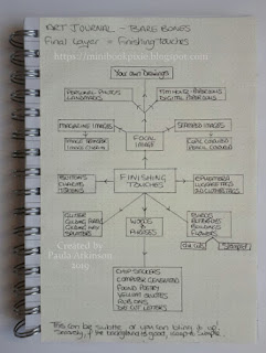
Bare Bones: Constructing an Art Journal Page.

There are many ways to construct an art journal page.
I have decided to break down the various methods,
into Base, Middle & Final Touches.
Below are three pages in my Colour Exploration Journal,
showing these in flow chart form.
Feel free to copy any of this if it helps you.
I found that by listing my supplies in this way,
I remember what I have & use them.

Base Layer.
This base page focuses on building
the bones of the page & creating texture.

Middle Layer. 
The middle layer page is all about ways
to add colour onto the base.

Final Touches. 
This focuses on ideas for focal points, quotes,
phrases & lists things I would use such
as ephemera, photos, stamped images.
I might well have far less or even more supplies than
who ever is reading this. The idea is, take a few
minutes to draw up a list of what you have, 
get them out & play with them!
If these do spark your imagination, do let me know.
You can share them with me on Instagram.

Saturday, 6 April 2019

Colour Exploration Journal - Page 6

This page is based on an Analogous plus
Complementary scheme.
Red, Red-Violet, Violet & Yellow
(Yellow being the complement of violet)
Dylusions Ink; Cherry Pie, Pomegranate Seed,
After Midnight, Lemon Zest.
The stencil is Memory Box Honeycomb
Stamps - free with Simply Cards & Papercraft 186
I absolutely love how this turned out!
I think I actually nailed a good composition & a clear visual triangle.
I used a technique I saw years ago on YouTube.
I used some old Papermania paper
for my base which was text.
I added stamping & stenciling.
I used some mini Prima Finnabair stamps.
I couldn't find suitable words for the page,
so I made up my own & printed them on my inkjet.
A coat of gel medium stops smudging.

Thursday, 4 April 2019

A Home of Her Very Own!

Congratulations to Claire, my ex train buddy.
She's finally gone & done it, she's got her first dream home!

Below is the card I made to congratulate her.

 I started by die cutting the Baroque shape by Tim Holtz.
Then I die cut the house which came free with  
issue 175 Simply Cards & Papercraft.
I coloured the shape using Distress Oxide ink in;
Tumbled Glass / Mowed Lawn.
Coloured the house with Inktense Pencils,
then added all the stamping details with the free stamps
that came with the house die.

Inside, I generated a simple computer sentiment
using the font Consolas, on to matte paper.
I then cut it to fit inside.

Tuesday, 2 April 2019

Colour Exploration Journal - Page 5

This page is designed around the
Split Complimentary scheme.
I used Yellow-Green, Blue-Green & Red.
Mixing my own colours using;
PaperArtsy - Lemon Meringue / Glass Blue
Dylusions; London Blue / Lemon Zest 
The Red was my Luminarte Silks in Crimson.
Stamp - Be Crafty, Inspired by Banksy - Hope.
Everyone tends to use Let Go,
so I decided to use Don't Hold On.
I used dictionary words to add
to the balloons.
I used a balloon die rather than the Banksy heart.